OUTCOMES:
1/ User Satisfaction: 98% of our beta testers expressed their complete satisfaction post the
2/ Accessibility: Ensured app accessibility by checking font sizes and colors. Received appreciation from multiple users specifically mentioning this in our feedback form.
3/ Prioritising Right Features: As we were introducing many different features, it was challenging to keep it simple and make sure the idea was coming through to people as we imagined it to be.
FEEDBACK:
Our feedback form has been highly effective in gathering valuable responses and identifying areas of improvement.

Feedback form
Could you share your initial thoughts as you set up your profile? Was there anything specific that stood out during the onboarding process?
Were there any specific areas where you felt lost? was it easy to navigate through the app?
Easy to understand the features?
What features or tools encouraged you to engage more with the app?
Feedback Questions
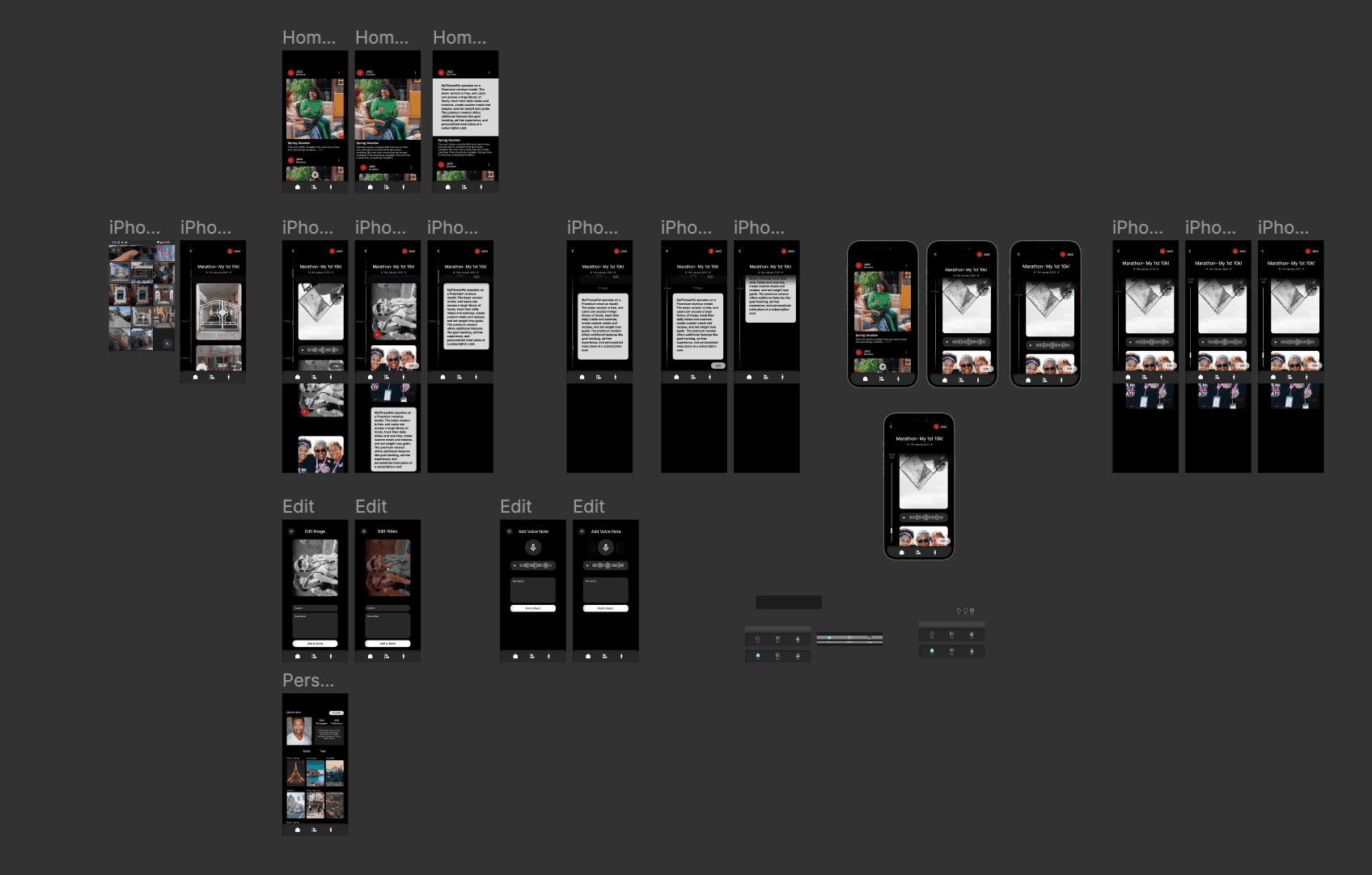
V1 Design
WORK: RUBBERBAND
OVERVIEW:
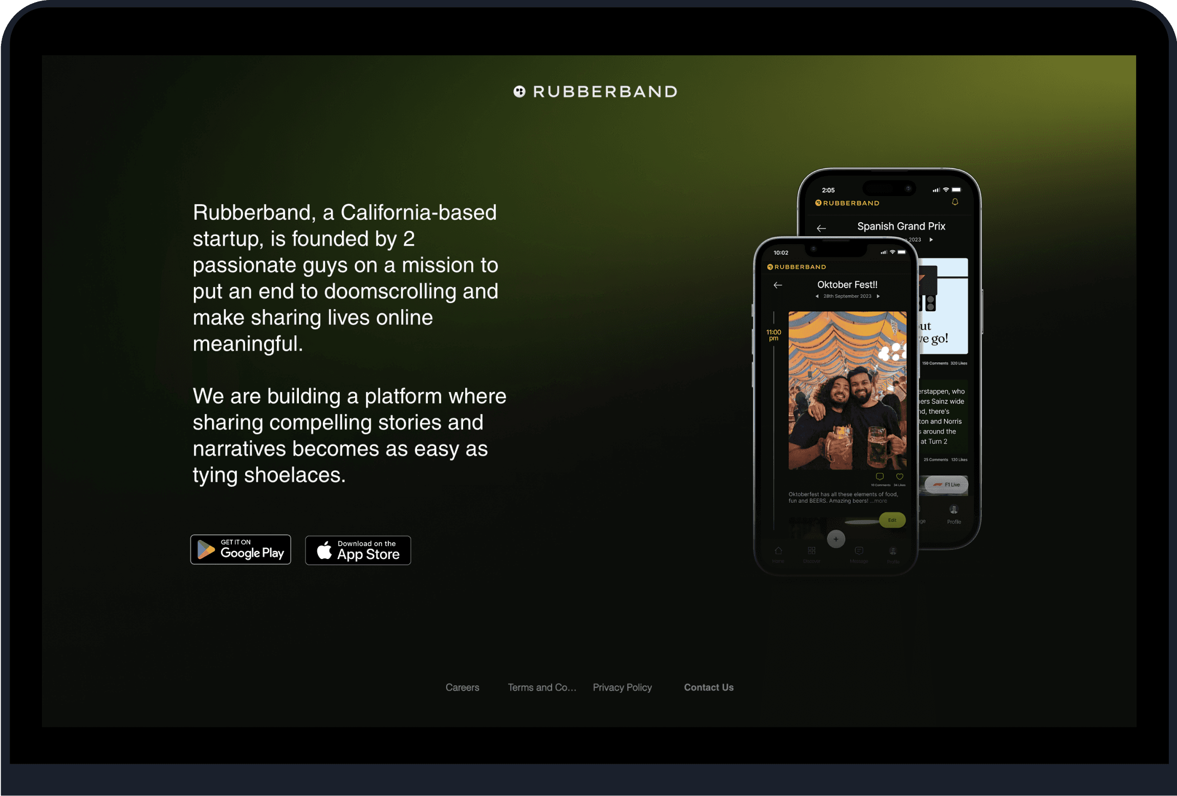
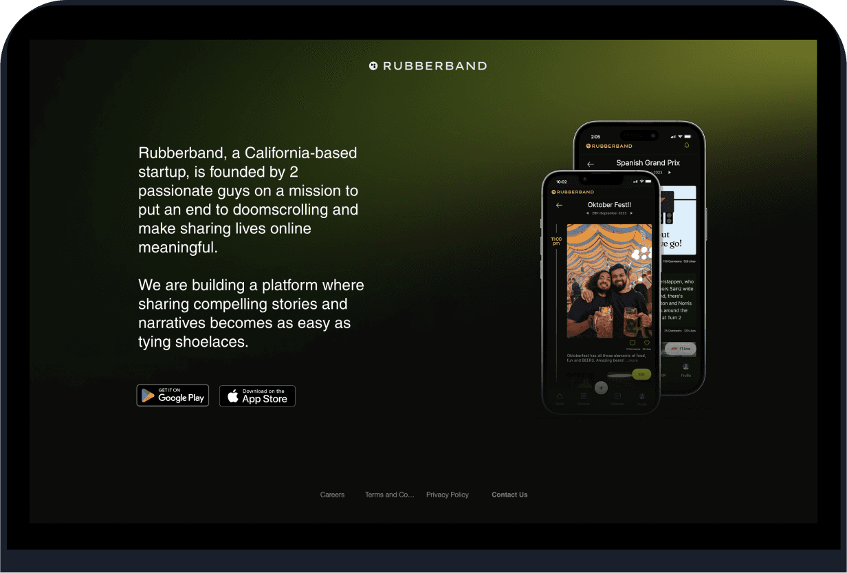
Whatever we share on social media has become shallow. Rubberband aims to encourage users to share meaningful in-depth stories. I led the design team at Rubberband.
Received 98% user satisfaction post their 3rd time usage of the app. Increased DAU by 34% and D7 retention by 40%.
Made sure Rubberband's design prioritizes color accessibility, adhering to WCAG standards, ensuring inclusive usability for all, including those with visual impairments.
https://www.rubberband.social/
ROLE:
Lead Designer
TEAM:
Co-Founder
Lead developer
Front-end Developer
BACKGROUND:
Current Social Landscape is 4.8B users with $167B revenue, yet authenticity and trust is missing. The goal of Rubberband was to be good at storytelling effortlessly and producing quick yet quality content creation, whilst taking into consideration other social aspects like discovering new trends, keeping in touch with friends and family.
THE USER:
15-35 seeking genuine connections, meaningful conversations, and a platform that aligns with their diverse interests and passions.
THE PROBLEM:
There are several genuine problems with current social media platforms that a new app could address. We did a survey with 1000+ participants and decided to focus on -
1/ Content Overload and Algorithm Bias - curate content based on user interests and preferences, emphasizing quality over quantity. Introduce diverse perspectives and critical thinking features to break echo chambers.
2/ Superficial Stories and Relationships - Most social media interactions and posts remain superficial, lacking depth and authenticity.
3/ Content creation taking way too long to create - So many people are discouraged and overwhelmed by the time and effort taken even to post a series of photos.
MY PROCESS:


EMPATHISE
Research
Pain Points
Customer Journey
Architecture
Wireframe
Design System
Prototype
Ui
Testing
DEFINE
IDEATE
PROTOTYPE
TEST
Design Process
EMPATHISE & DEFINE:
In this stage, empathise with the users understand their POV and to define a problem we were trying and planning to solve for.
After interviewing 1000+ people the outcomes were:
Make it easier and quicker to create content.
Curate content based on user interests and preferences, emphasizing quality over quantity. Introduce diverse perspectives and critical thinking features to break echo chambers.
Encourage users to share personal experiences, stories, and knowledge.
Reduce doom-scrolling
Mocking with blockframes, I got feedback on general layouts and information architecture.
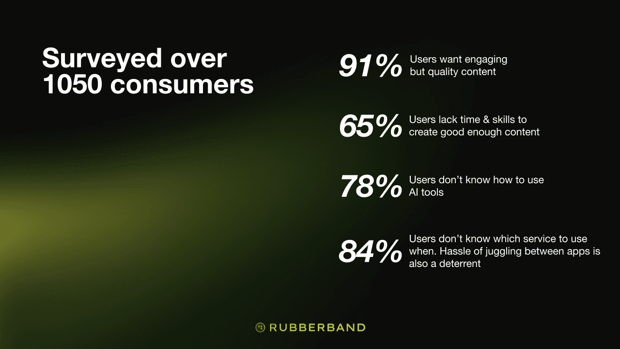
Survey Results
EXPLORATIONS:
We sat down to brainstorm ideas and generate a wide range of creative ideas to solve the defined problem by Storyboarding and a “How might we” session to facilitate and explore ideas after which we made wireframes and created prototypes.
TESTING:
Created an interactive prototype of new features and test them with users to gather feedback before full implementation.
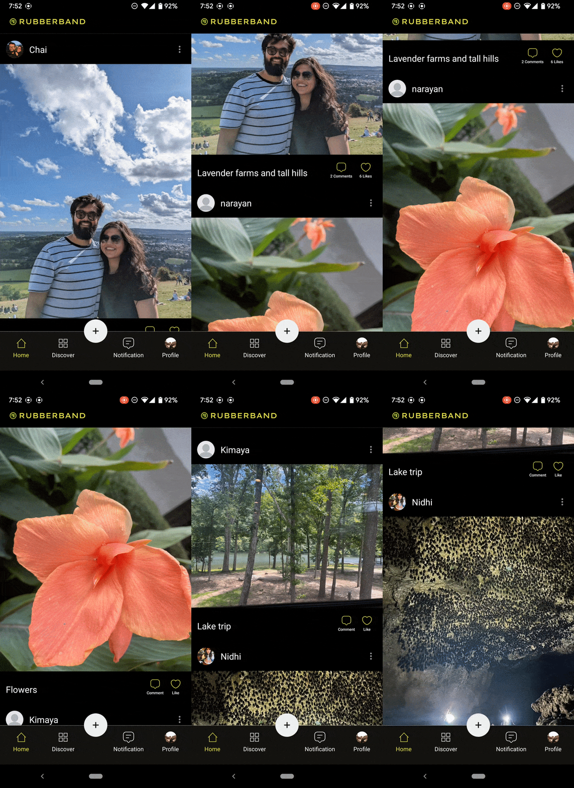
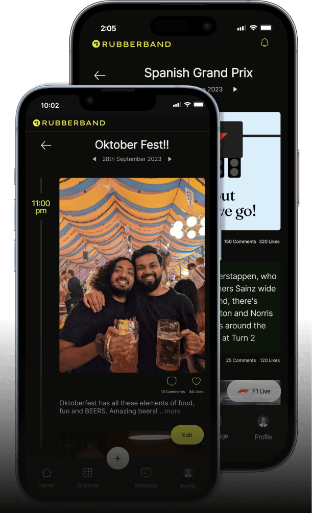
V1 feedback on the home screen, take-aways were-
“I’m a bit confused with the difference between this and the bands.”
“I think the location should be placed somewhere else. Right now If I want to read more, I end up clicking on it unintentionally.”
INFORMATION ARCHITECTURE:
Jotting down and mapping the structure for the app before we get to design.
CARD SORTING:
I then organized and led a design workshop where we performed a card sorting exercise in Miro. To organize and prioritize different features or functionalities based on team and users feedback.
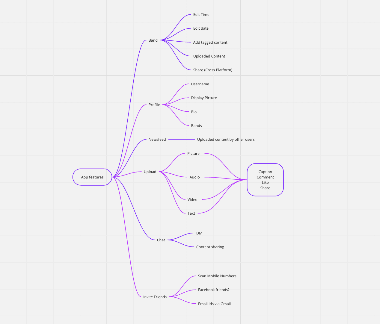
Information Architecture of the App
ITERATIONS:
1/ Changed the hierarchy of elements on the home page.
2/ The profile page got a do-over. The colours weren’t going well nor was the layout.
3/ Colours were added. Initially we were planning on going with a black and grey overall theme but we decided to use yellow and green as a pop and ads a unique element to the page, makes it more distinguishable.


OUTCOMES:
1/ User Satisfaction: 98% of our beta testers expressed their complete satisfaction post the
2/ Accessibility: Ensured app accessibility by checking font sizes and colors. Received appreciation from multiple users specifically mentioning this in our feedback form.
3/ Prioritising Right Features: As we were introducing many different features, it was challenging to keep it simple and make sure the idea was coming through to people as we imagined it to be.
FEEDBACK:
Our feedback form has been highly effective in gathering valuable responses and identifying areas of improvement.
WORK: RUBBERBAND
OVERVIEW:
Whatever we share on social media has become shallow. Rubberband aims to encourage users to share meaningful in-depth stories. I led the design team at Rubberband.
Received 98% user satisfaction post their 3rd time usage of the app.
Made sure Rubberband's design prioritizes colour accessibility, adhering to WCAG standards, ensuring inclusive usability for all, including those with visual impairments.
https://www.rubberband.social/
ROLE:
Lead Designer
TEAM:
Co-Founder
Lead developer
Front-end Developer
BACKGROUND:
Current Social Landscape is 4.8B users with $167B revenue, yet authenticity and trust is missing. The goal of Rubberband was to be good at storytelling effortlessly and producing quick yet quality content creation, whilst taking into consideration other social aspects like discovering new trends, keeping in touch with friends and family.
THE USER:
15-35 seeking genuine connections, meaningful conversations, and a platform that aligns with their diverse interests and passions.
THE PROBLEM:
There are several genuine problems with current social media platforms that a new app could address. We did a survey with 1000+ participants and decided to focus on
1/ Content Overload and Algorithm Bias - curate content based on user interests and preferences, emphasizing quality over quantity. Introduce diverse perspectives and critical thinking features to break echo chambers.
2/ Superficial Stories and Relationships - Most social media interactions and posts remain superficial, lacking depth and authenticity.
3/ Content creation taking way too long to create - So many people are discouraged and overwhelmed by the time and effort taken even to post a series of photos.
MY PROCESS:
EMPATHISE & DEFINE:
In this stage, empathise with the users understand their POV and to define a problem we were trying and planning to solve for.
After interviewing 1000+ people the outcomes were:
Make it easier and quicker to create content.
Curate content based on user interests and preferences, emphasizing quality over quantity. Introduce diverse perspectives and critical thinking features to break echo chambers.
Encourage users to share personal experiences, stories, and knowledge.
Reduce doom-scrolling
Mocking with blockframes, I got feedback on general layouts and information architecture.
EXPLORATIONS:
We sat down to brainstorm ideas and generate a wide range of creative ideas to solve the defined problem by Storyboarding and a “How might we” session to facilitate and explore ideas after which we made wireframes and created prototypes.
TESTING:
Created an interactive prototype of new features and test them with users to gather feedback before full implementation.
V1 feedback on the home screen, take-aways were-
“I’m a bit confused with the difference between this and the bands.”
“I think the location should be placed somewhere else. Right now If I want to read more, I end up clicking on it unintentionally.”
INFORMATION ARCHITECTURE:
Jotting down and mapping the structure for the app before we get to design.
CARD SORTING:
I then organized and led a design workshop where we performed a card sorting exercise in Miro. To organize and prioritize different features or functionalities based on team and users feedback.
ITERATIONS:
1/ Changed the hierarchy of elements on the home page.
2/ The profile page got a do-over. The colours weren’t going well nor was the layout.
3/ Colours were added. Initially we were planning on going with a black and grey overall theme but we decided to use yellow and green as a pop and ads a unique element to the page, makes it more distinguishable.

Information Architecture of the App


Design Process

Survey Results

V1 Design

Feedback Questions

BACKGROUND:
Current Social Landscape is 4.8B users with $167B revenue, yet authenticity and trust is missing. The goal of Rubberband was to be good at storytelling effortlessly and producing quick yet quality content creation, whilst taking into consideration other social aspects like discovering new trends, keeping in touch with friends and family.
THE USER:
15-35 seeking genuine connections, meaningful conversations, and a platform that aligns with their diverse interests and passions.
THE PROBLEM:
There are several genuine problems with current social media platforms that a new app could address. We did a survey with 1000+ participants and decided to focus on -
1/ Content Overload and Algorithm Bias - curate content based on user interests and preferences, emphasizing quality over quantity. Introduce diverse perspectives and critical thinking features to break echo chambers.
2/ Superficial Stories and Relationships - Most social media interactions and posts remain superficial, lacking depth and authenticity.
3/ Content creation taking way too long to create - So many people are discouraged and overwhelmed by the time and effort taken even to post a series of photos.
EXPLORATIONS:
We sat down to brainstorm ideas and generate a wide range of creative ideas to solve the defined problem by Storyboarding and a “How might we” session to facilitate and explore ideas after which we made wireframes and created prototypes.
TESTING :
Created an interactive prototype of new features and test them with users to gather feedback before full implementation.
V1 feedback on the home screen, take-aways were-
“I’m a bit confused with the difference between this and the bands.”
“I think the location should be placed somewhere else. Right now If I want to read more, I end up clicking on it unintentionally.”
INFORMATION ARCHITECTURE :
Jotting down and mapping the structure for the app before we get to design.
CARD SORTING :
I then organized and led a design workshop where we performed a card sorting exercise in Miro. To organize and prioritize different features or functionalities based on team and users feedback.
WORK: RUBBERBAND
OVERVIEW:
Whatever we share on social media has become shallow. Rubberband aims to encourage users to share meaningful in-depth stories. I led the design team at Rubberband.
Received 98% user satisfaction post their 3rd time usage of the app.
Made sure Rubberband's design prioritizes color accessibility, adhering to WCAG standards, ensuring inclusive usability for all, including those with visual impairments.
ROLE:
Lead Designer
TEAM:
Co-Founder
Lead Developer
Developer
MY PROCESS:
EMPATHISE & DEFINE:
In this stage, empathise with the users understand their POV and to define a problem we were trying and planning to solve for.
After interviewing 1000+ people the outcomes were:
Make it easier and quicker to create content.
Curate content based on user interests and preferences, emphasizing quality over quantity. Introduce diverse perspectives and critical thinking features to break echo chambers.
Encourage users to share personal experiences, stories, and knowledge.
Reduce doom-scrolling
Mocking with blockframes, I got feedback on general layouts and information architecture.

Survey Results

Information Architecture of the App
ITERATIONS :
1/ Changed the hierarchy of elements on the home page.
2/ The profile page got a do-over. The colours weren’t going well nor was the layout.
3/ Colours were added. Initially we were planning on going with a black and grey overall theme but we decided to use yellow and green as a pop and ads a unique element to the page, makes it more distinguishable.
Design Process

OUTCOMES:
1/ User Satisfaction: 98% of our beta testers expressed their complete satisfaction post the
2/ Accessibility: Ensured app accessibility by checking font sizes and colors. Received appreciation from multiple users specifically mentioning this in our feedback form.
3/ Prioritising Right Features: As we were introducing many different features, it was challenging to keep it simple and make sure the idea was coming through to people as we imagined it to be.
FEEDBACK :
Our feedback form has been highly effective in gathering valuable responses and identifying areas of improvement.

Feedback form
Could you share your initial thoughts as you set up your profile? Was there anything specific that stood out during the onboarding process?

Feedback Questions

V1 Design
